Since the company’s founding day in 2007, we’ve been honored to see the Dropbox community develop, grow, and thrive. To celebrate, we’re putting together a series of posts looking back at an exciting—and often surprising—decade. Join us as we reminisce, share a few stories, and reflect on how the industry has changed.
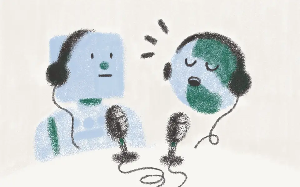
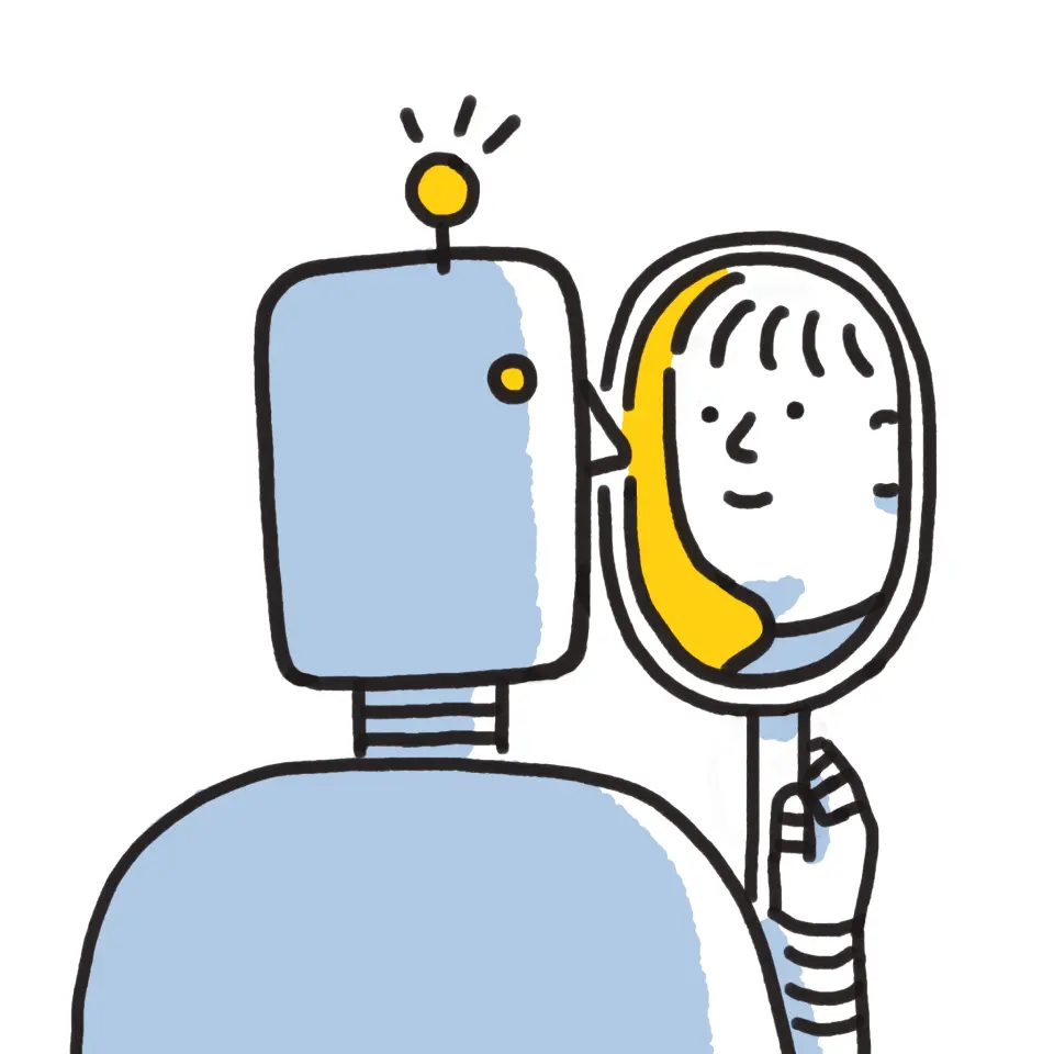
Since the earliest days of Dropbox, we’ve tried to connect with users through illustration. Whether we’re announcing a new product or fixing a pesky bug, we know users prefer to hear the news from fellow humans, not robots. Much of the Dropbox visual style has developed along those lines: personal, hand-drawn, playful.
In many cases, we’ll design several concepts before picking the option that’s just right. Here are 10 illustrations the design team loved, even if they missed the final cut.
1. Designing words with data
“I really like how the concept turned out in this one—an illustration about taking a data-minded approach in UX writing. In the end, we decided to go with a less digital, more playful style, but I hope to apply concepts like this again in the future.” - Justin Tran, Illustrator
2. Over quota

“We haven’t often depicted animals with human qualities, so I enjoyed giving this character a few human touches: a smile, a pair of glasses, a kiddie pool. While we wound up using a different animal, I liked the whimsical feel of this design.” - Justin T.
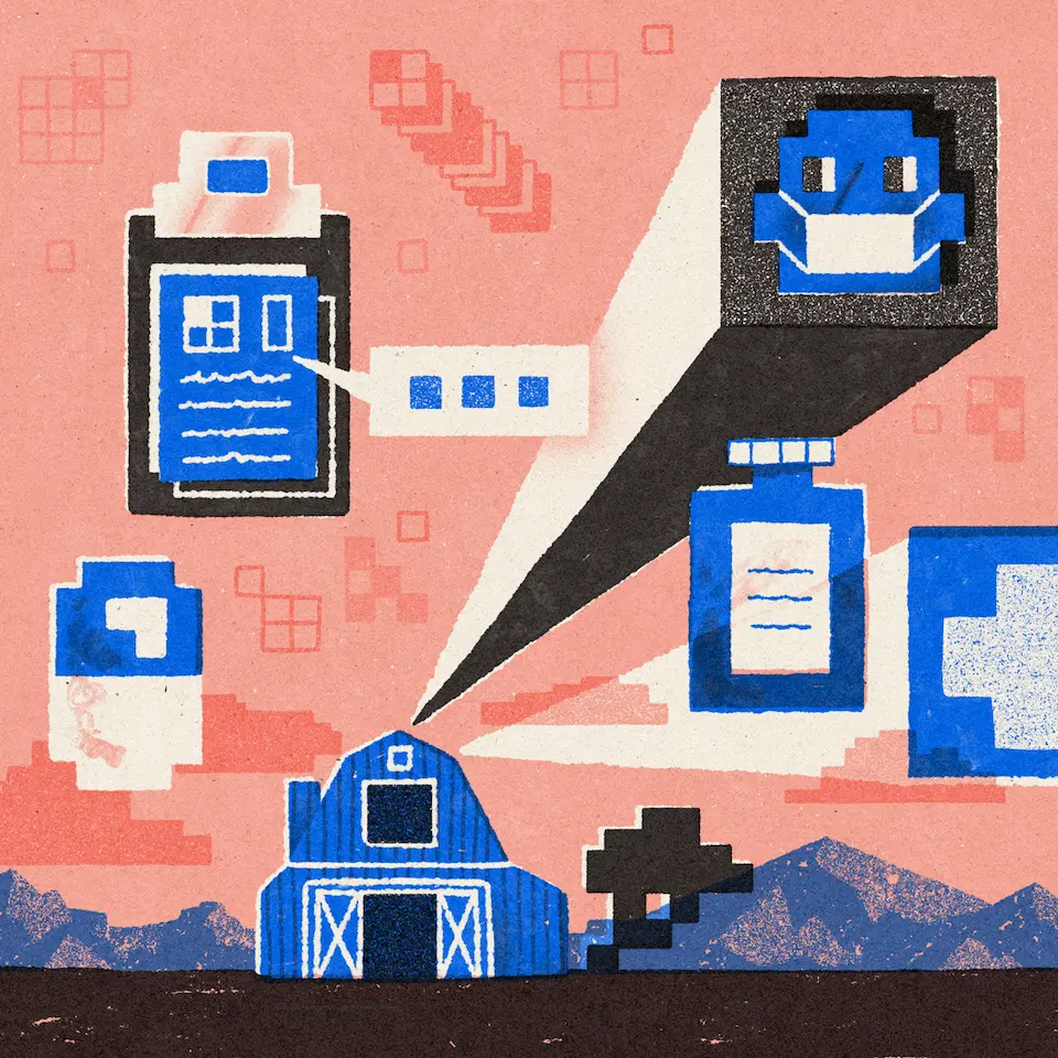
3. Billing options
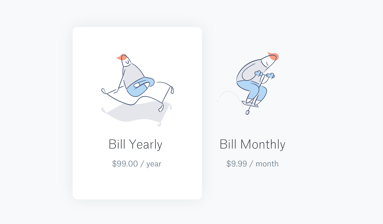
“The sign up process is a great moment to start a relationship with the user. Here, we tried a very conceptual way to think about billing options. We ended up going with a simpler concept, but the pogo stick / magic carpet design was fun to draw on the first pass.” - Justin T.
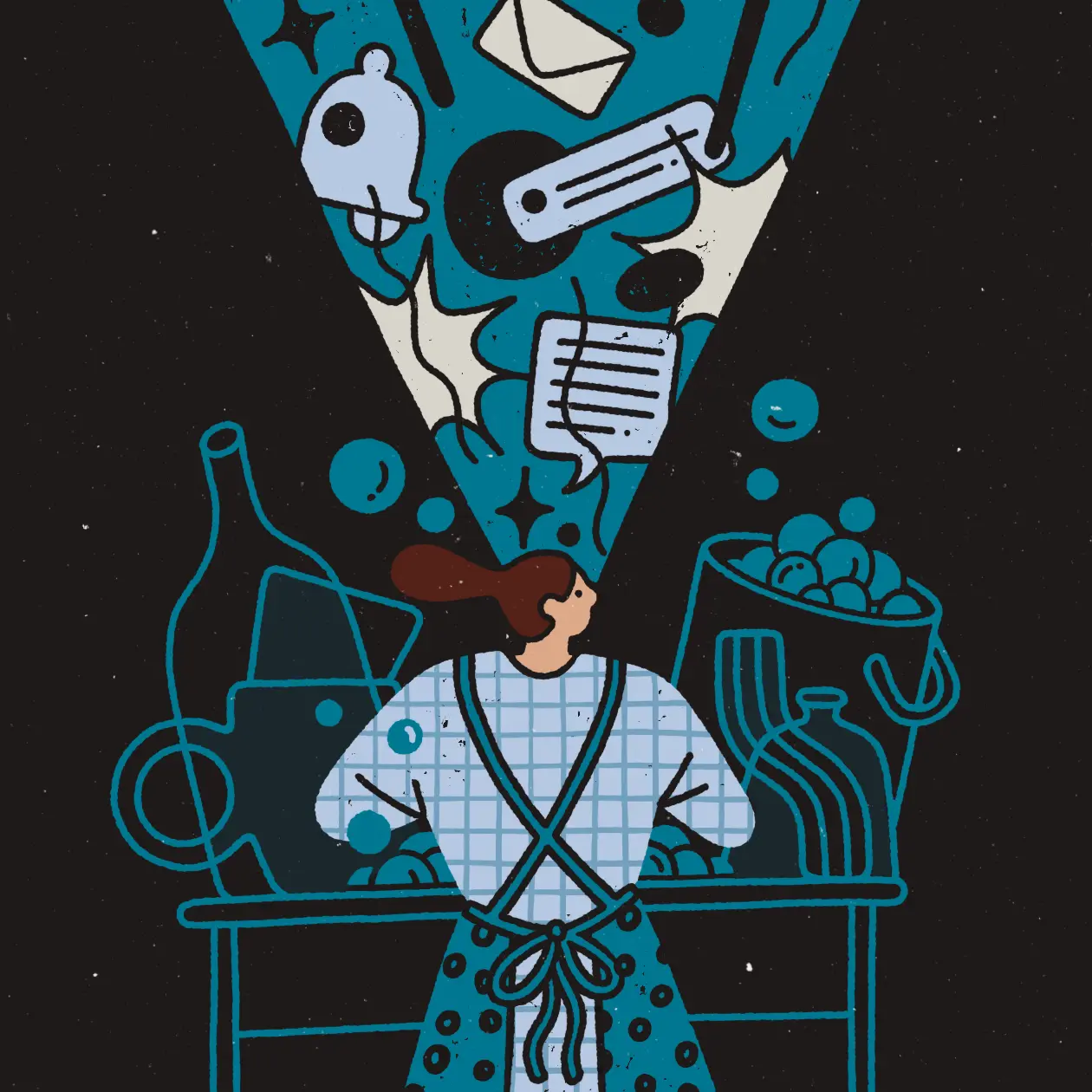
4. Feelings instead of features

“This illustration was part of a special Dropbox tour that we never launched. I had a lot of fun creating this joyous and fanciful world focused on feelings instead of features. I really wanted to capture a feeling of mobility and freedom.” - Fanny Luor, Illustrator
5. Scale, imagery, storytelling

“This was another unused sketch for that same tour. I enjoyed playing with scale, imagery, and storytelling to create an illustration that was more emotionally resonant. I liked blending Dropbox features with nature…for example, the ‘syncing flower’ and the photo as landscape.” - Fanny L.
6. Magic mobile features

“We had all these new features on mobile, and my first thought was, ‘it’s like magic!’ While we decided to go for more of a functional design in the end, I enjoyed bringing my reaction to life.” - Fanny L.
7. Stickers for Paper
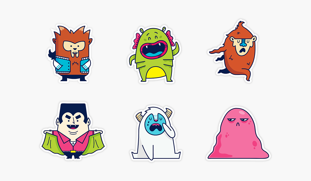
"In the early days of Dropbox Paper, we created simple character stickers to function as placeholders within the product. When we revisited them, we developed new sets that better communicated productivity concepts. The above characters weren’t closely tied to any of those concepts, so we left them out, but I’d still love to revisit them at some point.” - Brandon Land, Illustrator
8. Pop culture references
“It was really fun to try and incorporate pop culture references, like the early Jon Ying* days of Dropbox. We wanted users to feel an immediate connection, a sense of emotional resonance with the design.” - Brandon L.
*Note: Brandon is referring to Jon Ying, a pioneering Dropbox employee responsible for many of the company’s earliest illustrations.
9. Inside the Dropbox office culture
“I made various spot illustrations for fellow Dropbox employees, purely to capture a bunch of Dropbox-isms. For example, ‘one-on-one,’ is literally two number ones stacked on top of each other. ‘N’ is in a sink to show when people or files are ‘in sync.’ And then a spoon and a fork had a baby, creating a spork, to represent collaboration.” - Brandon L.
10. The Dropbox community
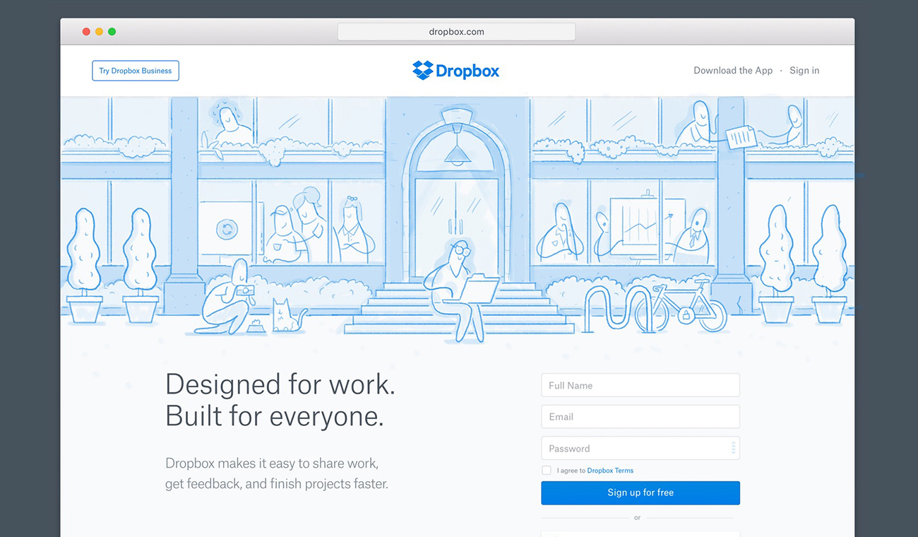
“This unused sketch was made for a possible dropbox.com homepage. We wanted to take a narrative approach, sharing how people use Dropbox in the workplace. In the end, we decided the concept needed to be a bit more straightforward and educational, but I still loved this design for the way it depicted a sense of community.” - Brandon L.
The Author